The logos above were created for the Memory Exhibition; the first design was inspired by logo researches. I used a minimal brain design along with mechanisms to show how the brain relates to the mechanisms. I used helvetica in caps for a professional finishing; I did each design in different colours and scales to see if they would be able to work with any colour and in any size. As you can see the smallest scale isn't as affective as the rest because the worn memory is not legible.
Class Crit: The brain design is too generic so the design needs to be less generic and more abstract but interesting at the same time. The same goes for the second design, the brain wouldn't be legible if it was scaled down, but they both have potential.
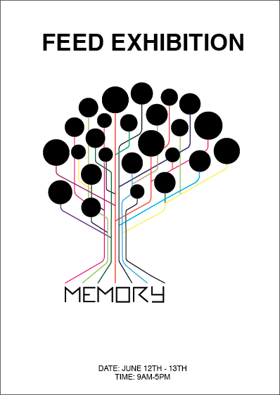
This is my second design; I decided to make the brain icon less generic but at the same time giving it a technological effect by adding the colourful lines.
Class crit: When scaled down it's going to lost some of the lines, so replace some of them with bigger lines and maybe use less circles. The font is great; it complements the logo but that also wouldn't be legible if scaled down.


No comments:
Post a Comment